Private case study
Introducing
Your global wallet. Three accounts. One clear system.
"The answer isn't the interesting part. The question is."
Ontop asked for a Home Page showing 3 accounts with their balances and available actions, plus a complete flow for moving money between accounts — including what happens when a user tries to send money back to Payroll. Which is blocked.
Receives from employer only · Can send to USDc and Growth
Receives from Payroll, crypto, ACH · Can send to Growth · Cannot send to Payroll
Earns 4.2% APY yield · Withdrawals subject to lock-up · Cannot send to Payroll
A wallet with asymmetric rules generates anxiety. Users don't know why some transfers are blocked. In fintech, anxiety kills trust, and trust is the product.
The real design question wasn't "how do I show 3 accounts?" It was: "how do I make users understand the system before they hit a wall?"
If something must choose between looking good and being understood, understanding wins.
Better to never reach the error than to show a great error message.
Never hide system constraints. Showing the rules builds more trust than pretending they don't exist.
Three accounts. Clear rules. Zero friction.
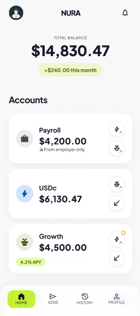
Each account has a unique icon — 💼 ⚡ 🌱 — used consistently across every screen. Users learn the visual language once and navigate without reading.
Rules are shown at the moment they matter — lock-up warnings appear in the send flow, not in settings buried three levels deep.
Users see exactly what they can do — and when something's blocked, they see why. No dead ends. No confusion. No lost trust.
Screens designed in Figma.
Figma prototype link coming soon.
From Latin nutrire — to nourish. Works in Spanish, English and Portuguese. No existing fintech trademark.
Ontop already uses these names. Matching them shows system thinking, not ego.
Ontop's product is light mode. Ignoring that context would be a judgment error.
Standard green #22C55E lost differentiation. Lime keeps the meaning, adds identity. Used only for primary CTAs.
⚡ means USDc. 🌱 means Growth. The icon is the destination. Learned once, used forever.
Payroll appears grayed out in selectors — not hidden. Hiding it creates confusion. Showing it creates understanding.
Here's what I considered — and why I didn't go there.
"Wall" means barrier. Wrong for a product about money flow.
Speed without growth. Doesn't serve the savings narrative.
Fits the Ontop ecosystem. Dropped — didn't want to look like a sub-product.
Latin nutrire. 3 languages. No fintech trademark.
The same happened with account names.
Savings sounds passive. Wallet is too generic.
Too far from Ontop's existing language.
These are the names Ontop already uses in production. Matching their language is smarter than inventing new ones.
Tested all four labels. None felt right. Allocate was too corporate. Move suggested external. Rebalance was too financial-advisor.
The most important thing below the total isn't an action — it's what the money is doing. The Send tab in the nav is there to explore.
Buries the most motivating data point. User has to look for it inside one card.
What I earned this month belongs at the top level — it's the metric that makes users come back.
Correct for investment portfolios. Wrong here. Balance size is less important than account role.
The order follows the money. Enter via Payroll. Operate via USDc. Grow via Growth.
Standard #22C55E is the default of every fintech app. It signals nothing. Lime keeps the cultural meaning — money, growth, go — while creating identity. Used only for primary CTAs. Never decorative.
Blue for Payroll — institutional, regulated, employer-issued. Lime for USDc — operational, the daily-use account. Amber for Growth — the universal color of accumulated value. Bloomberg uses gold for returns. I followed that convention intentionally.
Green only for positive values — income, Free, Instant. Red with a pink tint, not pure #FF0000 — "this can't be done" not "you made a critical error".
Removed
Removed
Kept
How this shows up on each card
The buttons don't say "Send". They show the destination.
Learned once. No label needed.
The action buttons on the home cards were a deliberate decision outside the challenge scope. For the prototype they're not fully wired — but the intent is direct and unambiguous: tap the destination, money moves there.
Payroll is visible but grayed at 40%. Not hidden. The user understands before tapping.
All 6 rules visible at once. The moment of maximum attention is the best moment to teach.
Not a hardcoded alternative. The right redirect depends on where the user came from.
I also thought carefully about the swap button between accounts. If you're sending Growth → USDc you can flip the direction. But if FROM is Payroll, the swap is disabled — tapping it takes you to the logical selection screen instead of trying to reverse an impossible route.
The three paths a user can take
⏱ icon next to USDc option when FROM is Growth. One icon. No words.
Before the user types a number.
Still visible at the last confirmation step.
Not ✓ Instant. Honest about what happened.
The one thing missing: a bottom sheet explaining why the lock-up exists. My assumption — funds are locked because they're actively generating yield inside a fund and need to exit that position before being transferred. That explanation deserves its own moment in the flow. Noted for v2.
Payroll only receives from your employer. This keeps your income organized and your account secure.
| Payroll → USDc | ✅ |
| Payroll → Growth | ✅ |
| USDc → Growth | ✅ |
| Growth → USDc | ⏱ |
| USDc → Payroll | 🚫 |
| Growth → Payroll | 🚫 |