Product Design Exploration · Web and mobile · Express 3-hour session
My Bookings, rebuilt as one model
I explored a redesign of the My Bookings experience for a sports booking platform: one booking model, one card grammar, one attention layer, shared across web and mobile.
Web and mobile used different mental models for the same booking data. Same domain, two information architectures.
Web and mobileOne shared modelExpress 3h sessionDiagnosis to system
This exploration was completed without access to production analytics or user research. The recommendations below are hypotheses to validate, not measured outcomes.
RESERVATIONIn 2 hours···
Court 3 · Smash Arena
10:00–11:00 · Orion · 4 players
✓ Paid · $24.00Check in
One card model · every booking type
Legacy state · Observed
Same booking domain, different information architecture
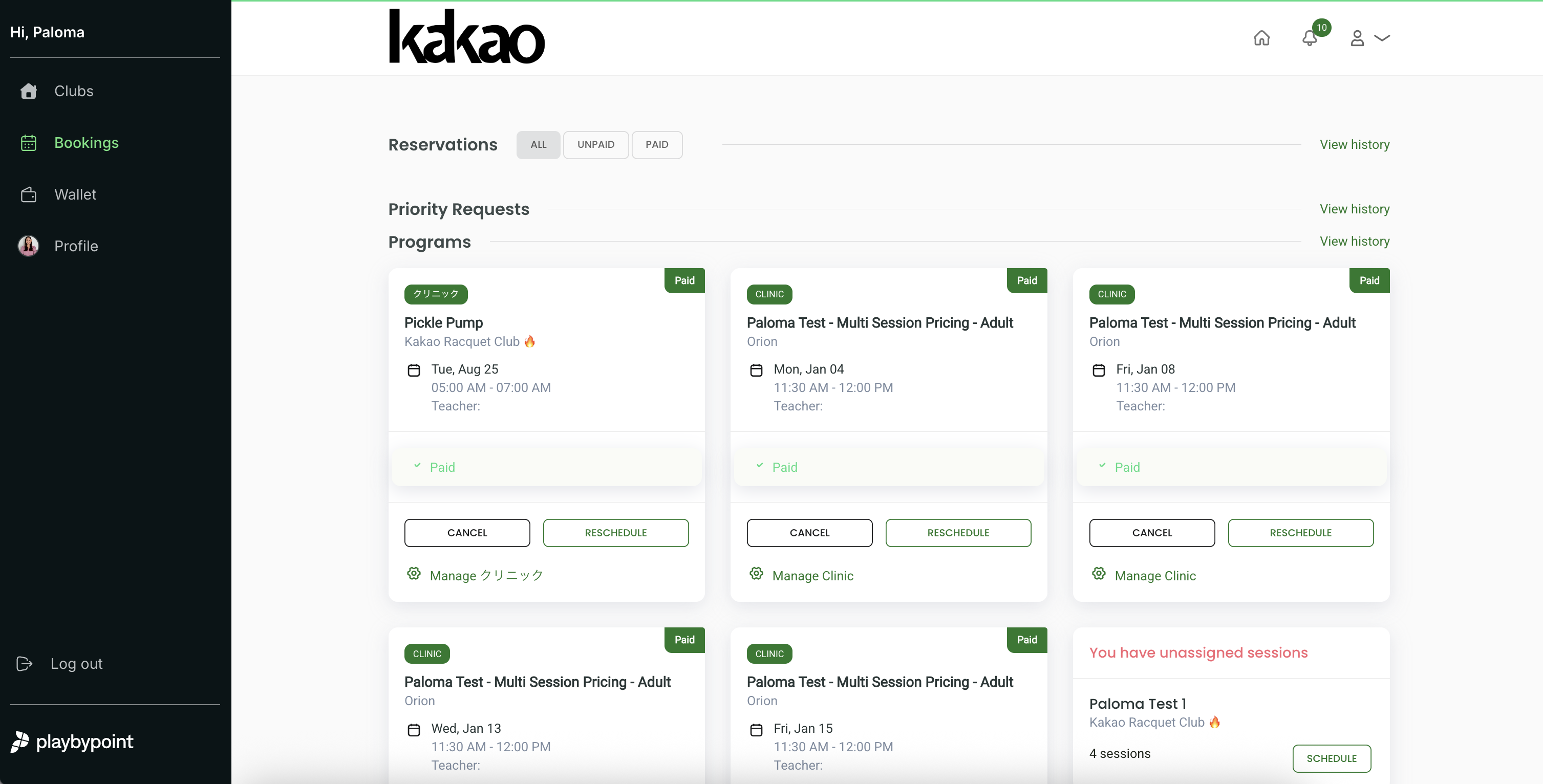
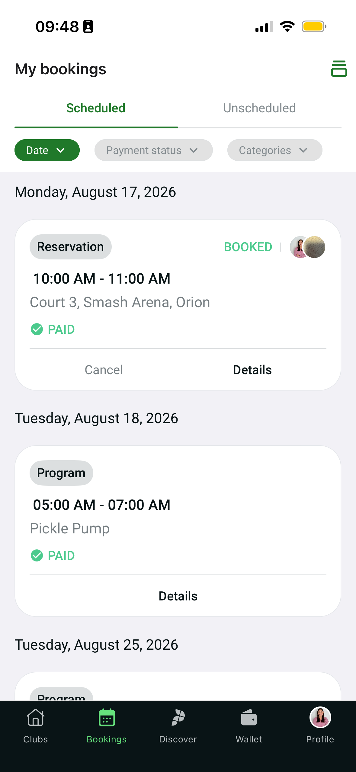
The starting point is the current product. One screen, two surfaces, captured as they ship today.
WebOrganized by booking type
MobileOrganized by date
Web. Reservations, programs and clinics are separated into tabs. You navigate the system by category, then scan for a date.
Mobile. The same booking types are mixed into one chronological list. You navigate by date, then work out the type.
Neither pattern is wrong on its own. The problem is that the two surfaces teach different mental models for the same underlying object: a booking. Everything that follows works from that single observation.
Diagnosis
The two surfaces disagreed on what a booking is
Reading the screenshots closely, three levels of certainty. What can be seen. What the redesign assumes. What would need the product and engineering team to confirm.
Web · Observed
Sorted by type
Reservations, programs and clinics live in separate tabs. You pick a category, then scan for a date. Cancel and Reschedule sit inline on every card.
Mobile · Observed
Sorted by date
Every type is mixed into one list, grouped by day. You scan the date, then work out the type. Cancel and Details only; no Reschedule, no prioritization.
Observed
Mixed language in a single view. On web, a Japanese type chip sits next to an English one, and a "Manage" link switches script mid-sentence. The interface does not commit to one locale.
Observed
Empty fields still render. A "Teacher:" label appears with nothing after it. Internal test names ("Paloma Test - Multi-Session Pricing - Adult") reach the member-facing card.
Observed
The action set changes with the surface. Web cards expose Cancel and Reschedule directly; mobile cards expose Cancel and Details. The same booking offers different capabilities depending on where you open it.
Observed
No prioritization on either surface. A payment that will auto-cancel and a session a month out carry the same visual weight. Nothing pulls the time-sensitive item forward.
Design hypothesis
A single card grammar plus a small attention layer would cut the cost of moving between web and mobile and surface the few actions that are actually time-bound. To be tested, not assumed.
Technical assumption
The two surfaces may read booking data through different models or endpoints today. The proposed system would benefit from a normalized booking view model that both consume. Feasibility and cost are unknown without the engineering team.
Process · Reduce
Many possible improvements, a few system-level decisions
Completed in an express 3-hour working session, combining product judgment, domain familiarity with racket-sport booking, and AI-assisted rapid prototyping to move from diagnosis to a testable system. AI accelerated exploration, synthesis and iteration. It did not make the prioritization, interaction or trade-off calls.
ExploredKeptCutWhy
Explored. Around fifty improvements from four angles: the player, the club, the coach, and cross-cutting platform concerns. Most were real but local. Rename a button, fix a margin, add a tooltip, adjust a tab.
Kept the five that change the system rather than a screen:
1One shared booking model, so a booking is the same object on both surfaces.
2One consistent card grammar for every booking type.
3One attention layer for genuinely time-sensitive actions.
4Progressive disclosure for payment complexity.
5One interaction model shared across web and mobile.
Cut or deferred. The local fixes, plus larger items held out on purpose: brand unification, the full payment flow, a notification system. Listed in Scope.
Why. Under three hours, the leverage is in decisions that transfer across every booking type, not in polishing individual cards. Five decisions that hold everywhere beat fifty that each fix one screen.
System · Systemize
One booking model, one card grammar, one attention layer
My Bookings is one subsystem inside a larger sports ecosystem: club discovery, wallet and credits, players and social, venue management. The booking model here is built to sit inside that whole. It shares the global navigation, the design tokens, and the same payment and credit state the wallet owns. Aligning it is not a screen redesign, it is aligning one object across the platform.
1One shared booking model. A booking is the same object on web and mobile.
2One consistent card grammar. Every type follows the same slots.
3One attention layer, for genuinely time-sensitive actions only.
4Progressive disclosure for payment complexity.
5One interaction model across both surfaces.
01 · The card model
The same slots, in every type
Type chip, relative time, overflow. Title, metadata. One payment indicator. Then a fixed action grammar: one primary in solid, one secondary in outline, and the overflow for everything destructive or rare. Empty fields are stated, never left hanging.
RESERVATIONTomorrow···
Court 3 · Smash Arena
Wed Aug 19 · 10:00–11:00 · Orion
4 players · you booked it
✓ Paid · $24.00Details
PROGRAMIn 5 days···
Pickle Pump
Tue Aug 25 · 05:00–07:00 · Kakao Racquet Club
No coach assigned
✓ Paid · 2 creditsDetails
CLINICPay today···
Multi-Session · Adults
Thu Aug 20 · 11:30–12:00 · Orion
Coach assigned · session 3 of 8
! Due · $18.00Pay $18.00
The payment breakdown does not expand the card. Deposit, balance, cancellation policy, and each player's share open in a bottom sheet on mobile and a popover on web, so the list keeps its scroll rhythm. Tap "View breakdown".
Web · popover
RESERVATIONTomorrow···
Court 3 · Smash Arena
Wed Aug 19 · 10:00–11:00 · Orion
! Balance · $12.00Pay balance
Payment breakdown
Deposit paid$12.00
Balance due$12.00
Total$24.00
Cancel more than 24h ahead: full deposit refunded. Within 24h: it stays with the club.
Mobile · bottom sheet
RESERVATIONSplit · 4···
Court 3 · Smash Arena
Wed Aug 19 · 10:00–11:00 · Orion
AM✓MR✓JP·SL·
2 of 4 have paid$6.00 each
! $9.00 unpaidRemind 2
Per-player breakdown · $6.00 each
AMAna M.✓ $6.00 paid
MRMia R.✓ $6.00 paid
JPJon P.deposit $3.00 · balance $3.00
SLSara L.unpaid · $6.00
Total$24.00
Cancel more than 24h ahead and every player gets their full deposit back.
Slot 1 · Type
Neutral chip. Type never changes the layout or the actions.
Slot 2 · Time
Relative first ("tomorrow"), the exact date in the metadata.
Slot 3 · Payment
One indicator, with the amount or the credits used. Glyph plus text, never colour alone.
Slot 4 · Actions
One primary in solid (Pay, Confirm, Check in) and one visible secondary in outline (Reschedule or View breakdown).
The "···" is only for the destructive or infrequent: cancel, release the slot, invite, share, view policies.
02 · The attention zone
Two urgent items, the rest you can defer
Only what is genuinely time critical stays visible: payments that auto cancel inside 24 hours and requests that expire today. Everything slower, unscheduled credit, expiring balance, drops to a secondary line you can open, snooze, or dismiss. The urgent zone never becomes a list to scan.
Needs your attention2Due soon
PAYMENT
Payment expires in 22h · $24.00
Court 3, Smash Arena · Thu Aug 20, 07:00
Pay $24.00···
REQUEST
Request pending · Expires today 18:00
Court 1, Kakao Racquet Club · Sat Aug 22, 09:00
Confirm···
4 paid sessions with no date
Adults Pack · $96.00 paid · expires Sep 30
1 session credit expiring
Expires Sep 30
03 · The web view
The whole screen
Attention zone, then Today, then Upcoming. The right rail carries the usual time slot, the release option, and the wallet. Scroll sideways to see the full width.
kakao
Notificaciones 10
My bookings
Tuesday, Aug 18 · Orion
AllBookingsProgramsClinics
Needs your attention2Due soon
PAYMENT
Payment expires in 22h · $24.00
Court 3, Smash Arena · Thu Aug 20, 07:00
Pay $24.00···
REQUEST
Request pending · Expires today 18:00
Court 1, Kakao Racquet Club · Sat Aug 22, 09:00
Confirm···
4 paid sessions with no date
Adults Pack · $96.00 paid · expires Sep 30
1 session credit expiring
Expires Sep 30
TodayTue Aug 18
RESERVATIONIn 2 hours···
Court 3 · Smash Arena
10:00–11:00 · Orion · doubles with Mia R. and Jon P.
AM✓MR✓JP·SL·
Split 4 ways · 2 of 4 have paid$6.00 each · Jon P. and Sara L. still owe
✓ Paid · $24.00Check in
Per-player breakdown · $6.00 each
AMAna M.✓ $6.00 paid
MRMia R.✓ $6.00 paid
JPJon P.deposit $3.00 · balance $3.00
SLSara L.unpaid · $6.00
Total$24.00
Cancel more than 24h ahead and every player gets their full deposit back.
You played this slot 7 of the last 8 weeks. Aug 25 is still open.
Book Aug 25Skip
If you skip, two options:
11:30 · Court 5
same Tuesday, open now
Book
Notify me if it opens
waitlist · 10:00, Court 3
Join
Can't make it?
Release a paid slot to the club instead of cancelling
Waitlisted members get priority. If someone takes it, you get the full credit back.
See eligible bookings
Wallet
6session credits
4 expire Sep 30
04 · Release a slot to the club
Cancel is a dead end
Cancel loses the court for the club and the credit for the member. Release offers the paid slot to the waitlist first. Three taps inside the same overflow menu.
Step 1 · Overflow
Court 3 · Smash Arena
Wed Aug 19 · 10:00–11:00
Invite playersShareRelease to the club →Cancel booking
Step 2 · Confirm
Offer this slot to the 12 members on the waitlist?
Your $24.00 comes back as full credit as soon as someone takes it. If no one does before 08:00, the booking stays yours.
At this time it usually gets taken within 20 min
Release slotBack
Step 3 · On the list
RESERVATIONOffered · tomorrow
Court 3 · Smash Arena
Wed Aug 19 · 10:00–11:00 · Orion
Offered to the waitlist · 2 members viewing it
✓ Paid · $24.00Reclaim it
05 · The same system on mobile
Same slots, same actions, same order
The card does not change shape between platforms. Touch targets go to 44 pixels. Same two urgent items, same secondary alerts. The payment breakdown that was a popover on web is a bottom sheet here. Tap "View breakdown" on the Today card.
9:48···
My bookings
Filters
Needs your attention2
Payment expires in 22h · $24.00
Court 3, Smash Arena
Pay $24.00
Request pending · Expires today 18:00
Court 1, Kakao Racquet Club
Confirm
4 paid sessions with no date
Adults Pack · expires Sep 30
1 credit expiring
Expires Sep 30
TodayTue Aug 18
RESERVATIONIn 2 hours···
Court 3 · Smash Arena
10:00–11:00 · Orion · 4 players
AM✓MR✓JP·SL·
2 of 4 have paid$6.00 each
✓ Paid · $24.00Check in
Upcoming6
PROGRAMTomorrow···
Pickle Pump
Wed Aug 19 · 05:00–07:00
No coach assigned
✓ Paid · 2 creditsDetails
+5 more this month →
ClubsBookingsDiscoverAMProfile
Per-player breakdown · $6.00 each
AMAna M.✓ $6.00 paid
MRMia R.✓ $6.00 paid
JPJon P.deposit $3.00 · balance $3.00
SLSara L.unpaid · $6.00
Total$24.00
Cancel more than 24h ahead and every player gets their full deposit back.
9:48···
My bookings
To be scheduled
4 paid sessions, no date · $96.00
Adults Pack · expires Sep 30
Schedule sessions
✦
Nothing scheduled yet
But you have paid sessions waiting to be scheduled.
Find a court
Popular at Kakao Racquet Club
Tuesday mornings fill up first
3 courts open tomorrow, 10:00.
See timesJoin the waitlist
ClubsBookingsDiscoverAMProfile
Unscheduled sessions get one card that moves from pending to resolved. Same card, same slots, the progress bar and the primary action carry the state.
UNSCHEDULEDAction needed···
Adults Pack
Kakao Racquet Club · 4 of 4 sessions with no date
Credits expire Sep 30 · 43 days left
✓ Paid · $96.00Choose dates
PROGRAM✓ All sessions scheduled···
Adults Pack
Next: Mon Sep 1 · 09:00–10:00 · Court 1
Then Sep 8, 15 and 22 · coach assigned
✓ Paid · $96.00Details
06 · The empty state still has a job
Nothing scheduled is not nothing to do
If there is paid credit waiting for a date, the empty state shows it and offers the action. The rail keeps working too.
My bookings
Tuesday, Aug 18 · Orion
To be scheduledNo deadline soon
UNSCHEDULED
4 paid sessions, no date · $96.00
Adults Pack, Kakao Racquet Club · expires Sep 30
Schedule sessions···
✦
Nothing scheduled yet
But you have paid sessions waiting to be scheduled. Once you book a court or join a program, it shows up here grouped by day.
Schedule sessionsFind a court
Your usual slot
Tuesdays, 10:00 · Court 3
You played this slot 7 of the last 8 weeks. Aug 25 is still open.
Book Aug 25Skip
Explore · Secondary
Explorations the model made cheap
Not part of the core system. Each one reuses a state the card already has, which is the point: once the grammar is fixed, these cost almost nothing to add later.
Split costs between players
Who paid, who owes, each share. It opens from "View breakdown", so the list row stays one line. The primary action becomes "remind the ones who owe".
RESERVATIONSplit · 4
In the sheet · per player, $6.00 each
AMAna M.✓ paid
MRMia R.✓ paid
JPJon P.saldo $3.00
SLSara L.$6.00
! $9.00 unpaidRemind 2
Deposit, balance, policy in the sheet
The member sees the refund rule at the moment it matters, not buried in terms of service, and without the card growing.
RESERVATIONTomorrow
In the sheet · payment breakdown
Deposit paid$12.00
Balance due$12.00
Total$24.00
Cancel more than 24h ahead: we refund the full deposit. Within 24h: the deposit stays with the club.
! Balance · $12.00Pay balance
The usual time slot
If you play Tuesday at 10 most weeks, the rail offers to book it. Skip is not a dead end: it proposes another time or the waitlist.
Your usual slot
Tuesdays, 10:00 · Court 3
You played this slot 7 of the last 8 weeks. Aug 25 is still open.
Book Aug 25Skip
If you skip, two options:
11:30 · Court 5
same Tuesday, open now
Book
Notify me if it opens
waitlist · 10:00
Join
Principles
Each decision maps to one principle
Hick, Miller, Fitts, progressive disclosure. Not as decoration. Each one is tied to a specific choice on the card.
What principle justifies each decision
HICK
One primary and one secondary visible per card
Pay, Confirm or Check in in solid; Reschedule or View breakdown in outline. Cancel, release the slot, invite and share live in the "···". Two decisions in view, not six.
HICK
At most 2 urgent items in "Needs your attention"
Only payments due within 24 hours and requests that expire today. The rest drops to "secondary alerts", which can be opened, snoozed or dismissed. The urgent zone never becomes a list.
MILLER
At most 4 units per metadata line
Date · time · place · players. A fifth item drops to a second line. In the attention zone the headline carries the urgency ("Expires today 18:00") and the second line carries the context.
DISCLOSURE
The payment breakdown opens in a layer, not in the card
Deposit, balance, cancellation policy and per-player balance live in a bottom sheet (mobile) or a popover (web). The summary card keeps a single figure and the list keeps its scroll rhythm.
NULL DATA
An empty field is stated, not left hanging
"No coach assigned", never a "Coach:" label with no value. The exact same text on web and mobile. If the data does not feed a decision, the row is not rendered.
FITTS
44px minimum on frequent mobile actions
Pay, Check in, Confirm, Reschedule and View breakdown get a full touch target; the "···" overflow keeps 44×44 even though the glyph is small.
SALIENCE
One alert register per screen
Amber exists only in the attention zone and the pending-payment indicator. Today and Upcoming read in a neutral register.
CONSISTENCY
One card model for web and mobile
Same slots and same actions on both platforms: what you learn on one transfers to the other with no recalibration.
NO DEAD ENDS
Every exit offers an alternative
"Skip" proposes another slot or the waitlist; cancel proposes releasing the slot to the club; the empty state shows the paid credit still to be scheduled.
Trade-offs · Validate
What it assumes, what could block it, and what to test first
One object shared across two surfaces is a platform commitment, not only a UI change. Kept deliberately short: enough to show feasibility thinking, not an engineering specification.
Assumption
What the proposal leans on
Design hypothesis. One card grammar and one attention layer reduce the cost of moving between web and mobile, and cut the steps to the most common actions. This is the bet the whole system rests on.
Constraint
What could make it hard
Technical assumption. The two surfaces likely differ below the UI. Booking data may be modelled or served differently per platform. A normalized booking view model would be needed; its scope and cost are unknown without the engineering team.
Migration
How it could be introduced progressively
Technical proposal. Introduce a normalized booking view model so both surfaces consume the same taxonomy without a full rewrite.
Introduce the shared booking taxonomy.
Introduce the shared interaction model.
Migrate mobile.
Migrate web, keeping the type tabs as a saved filter.
Remove the legacy taxonomy once parity holds.
Validation · Hypotheses to validate
What to measure before committing
No production analytics were available for this exploration, so these are proposed success metrics, not measured outcomes.
Share of pending payments that auto-cancel.
Time from paid-credit purchase to first scheduled session.
Share of paid sessions scheduled before expiry.
Slot recovery rate after releasing a reservation.
Steps to pay or reschedule from the list.
Completion rate of high-priority booking actions.
Time to find a specific upcoming booking.
Nothing here was shipped or tested with users. The proposed design is a starting point for validation, not a result.
Scope
I deliberately stopped at the boundary of the problem
The following were intentionally not redesigned. Each is real; none of them is a My Bookings decision.
✕
Full payment and checkout flowCheckout, receipts, refunds. I changed how payment state is shown in the list, not how payment works.
✕
Brand unificationThe split web and mobile brand is a company-level decision. Noted, not touched.
✕
Backend rewriteThe migration path is designed to avoid one. Any deeper re-architecture is out of scope here.
✕
Club administration toolsThe venue-side surface has its own model and its own users. Different problem.
✕
Full notification systemThe attention layer is a prioritization surface for a handful of time-bound actions, not a notification center.