tomrullo.com
Product cases · Sr. Product Designer

Real case studies

Fintech · Crypto

Five real projects. Full context, justified decisions, and measurable results. Each one can be presented and defended in depth.

Due to confidentiality agreements, I'm unable to document all flows and screens as fully as I'd like. This applies even to my largest project: leading the integration of traditional finance into Bitso.
8M+
users reached, Bitso
+45%
engagement via A/B testing
92%
success rate, critical flow
6+
years in LATAM fintech & banking
01 · Banco del Sol
Digital bank
Product Designer · Full Ownership

From physical card to virtual

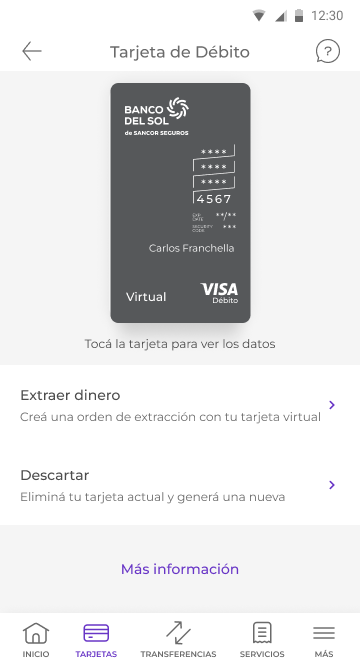
Banco del Sol is a 100% digital bank in Argentina. I joined the team with ownership over the main account and its core flows. When I took ownership of the card product, I found the most relevant problem: the physical debit card was the center of onboarding — the first thing a new user received, and the card the bank promoted by default. The virtual card existed, but no one actively promoted it. It was a secondary feature users stumbled upon by accident.

The physical card model carries real and growing costs: printing, personalization, postal delivery, replacement for lost or stolen cards, support for PIN resets at ATMs. Each physical card issued represents a concrete logistical cost, and as the user base grew, that cost scaled.

At the same time, Argentina's regulatory environment was beginning to question the mandatory issuance of plastic for products that could work entirely digitally.

The underlying problem wasn't technical or regulatory. It was structural: the physical card was issued automatically when opening an account, without the user requesting it. That made it the default product and left the virtual card in a provisional role.

I had full ownership of the card product, from problem definition to delivery. I actively participated in conversations with compliance to understand which regulations apply to debit card issuance in Argentina, what required a physical card, and what could be resolved digitally. That work was a prerequisite for the project — without understanding the regulatory framework, we couldn't change the issuance model.

I analyzed how other fintech products that had made this shift operated: Mercado Pago, Ualá, Revolut. In all cases, the key wasn't technological — it was product hierarchy: the virtual card was the primary product, with its own visual identity and dedicated flow.

The state I inherited was the opposite: the flow led users to the physical card, from which they could activate the virtual as an additional option. That hierarchy inadvertently communicated that virtual was secondary.

The most important decision wasn't a design one. It was a product one: convincing company leadership that the physical card should not be issued automatically when opening an account. The model I inherited was: new user → account opened → physical card issued and on its way. Changing that required building the argument from regulatory, operational cost, and user experience angles.

The new model: new user → account opened → virtual card active by default → physical card available only if the user requests it, with a deliberately friction-heavy flow. That friction step isn't a design error. It's the signal that the user made a conscious decision — not the automatic consequence of opening an account.

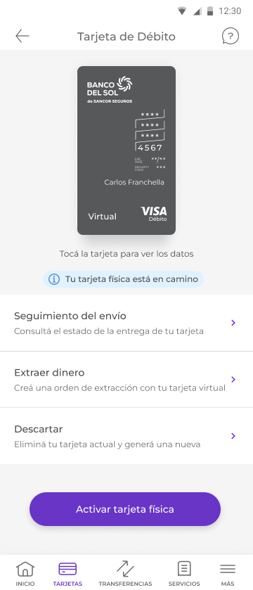
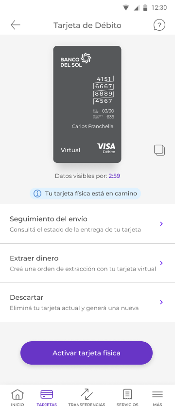
Once the issuance model was resolved, I designed the system states: the virtual card as the primary product with its own flow, the coexistence state when the physical is en route, and a postal tracking system so that waiting wouldn't make the virtual feel provisional.

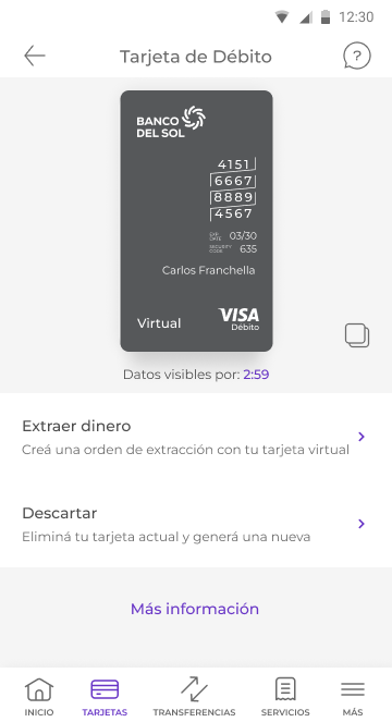
The most significant technical decision within the product was the timer-based reveal for sensitive data. The core tension of a virtual card is the security of the number, expiry, and CVV. I analyzed three alternatives.

Alternative Security Friction
Always hidden, with a permanent reveal button High High — too much friction for frequent use
Data always visible on screen Low — unacceptable risk Low
3-minute timer reveal High Low — system auto-hides, no action required to close

The coexistence state — when the user already has the virtual active and the physical is en route — required a visual hierarchy decision: the virtual had to read as the primary product, not as a waiting state. The physical was tracking context, not a destination. The postal tracking system was redesigned to reinforce that reading.
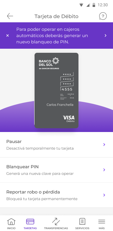
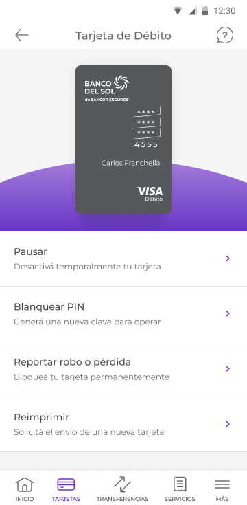
The virtual card became the primary activation method for new users. Activations grew ~60% in the months following launch, measured in Amplitude. The bank significantly reduced plastic issuance volume, with a direct impact on operational costs. What mattered most to me wasn't the number — it was that the perception shift worked. Users stopped treating the virtual card as provisional.

~60%
growth in virtual card activations
↓ costs
reduction in plastic card issuance
3 min
timer reveal, automatic security
FintechDigital Bank RegulationiOS OwnershipProduct

Full case study coming soon
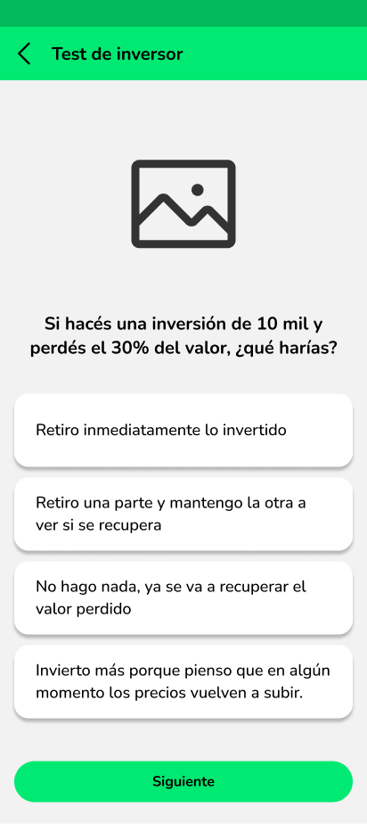
In addition to the virtual card, at Banco del Sol I designed the MODO integration, the Dólar MEP flow, and mortgage credits. None of these can be documented due to NDA, but are available for in-depth conversation.
02 · Bitso
Crypto exchange · 8M users
Product Designer · A/B Testing

+45% engagement in crypto discovery

Bitso is Latin America's largest cryptocurrency exchange, with more than 8 million active users across Mexico, Argentina, and Brazil. The Crypto tab is one of the highest-traffic surfaces in the app: the place where users explore the market, discover new assets, and make trading decisions. The 'New listings' section was the showcase for recently listed assets — high strategic relevance for the business, since a successful new asset generates trading volume.

The section existed but had low engagement. Users scrolled past it without interacting — not entering to see details, not exploring, not trading. There was a disconnect between the strategic importance the business assigned to new listings and users' actual behavior.

The question was: why? Was it a visibility problem, an information problem, or a design problem?

I was the Product Designer responsible for the entire experiment. I formulated the hypotheses, designed the three variants, defined the success metrics, and analyzed the results alongside the data team. The test ran across 100% of the Crypto tab's traffic — 8 million active users.

Before designing, I analyzed user behavior in the section with the available data. The pattern was clear: users scrolled past the cards without stopping. It wasn't a visibility problem — the section was in the top third of the screen.

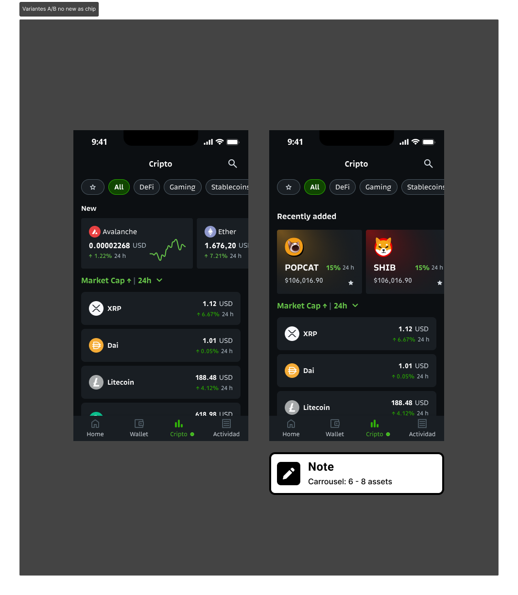
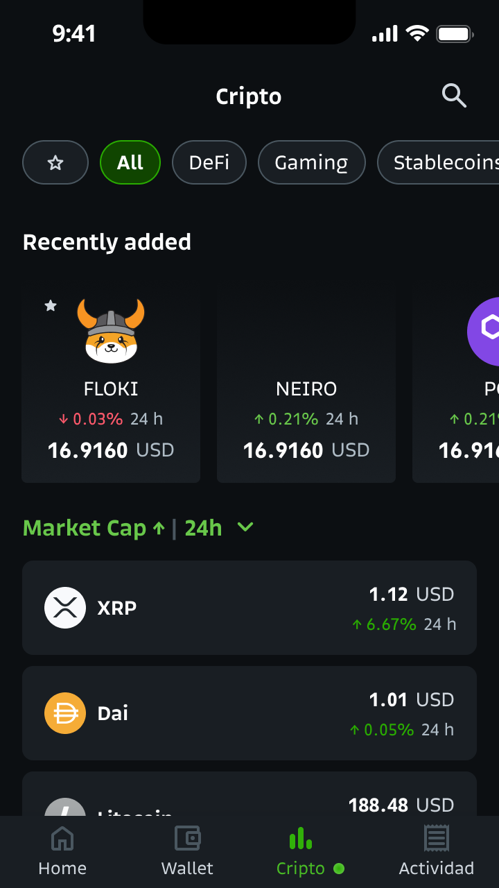
My hypothesis was that the design treated assets as financial data, when users treat them as cultural identities. In crypto — especially with meme coins — the decision to explore an asset doesn't start with price or performance, it starts with recognition. SHIB is a dog. PEPE is a frog. POPCAT is a meme. If the user doesn't visually recognize the asset, there's no motivation to tap.

The 24h chart taking up half the card wasn't adding value in the discovery moment — the percentage change already communicated the same thing more directly. The chart was visual noise consuming space that should belong to the asset's identity.

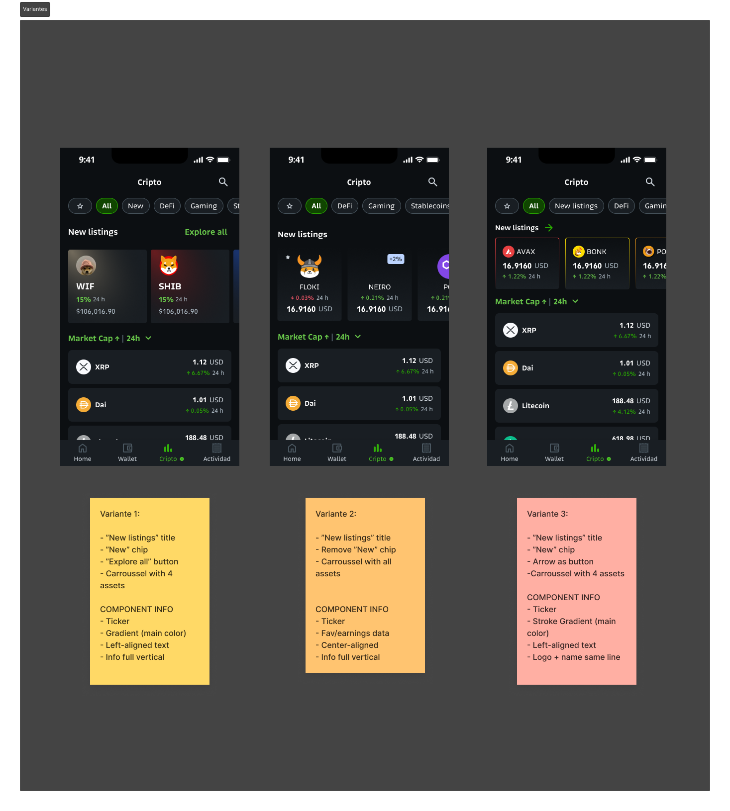
I designed three variants to isolate variables. Each tests a different hypothesis: if V1 wins, the problem was the component. If V2 wins, it was categorization. If V3 wins, it was visual identity.

Variant Key change Hypothesis Result
V1 · Improved control Ticker with gradient, 'New' chip, 'Explore all' Problem was the visual component
V2 · No 'New' chip No categorization filter, all assets visible Problem was categorization
V3 · Identity first Large logo, per-coin brand color, 'Recently added' Problem was visual identity +45%

+45% interaction with the new assets module. +5% conversion in asset detail — more users who reached the section ended up trading.

But the most interesting result was what the test revealed as a side effect: high churn on the asset detail screen. The discovery redesign sent more users to that screen, and the churn made visible a problem that was previously hidden by low traffic. I documented it as the next priority opportunity.

That's what I value most in a well-designed A/B test: it doesn't just validate a hypothesis — it generates new questions about the system.

+45%
interaction with new assets
+5%
conversion in asset detail
8M
users in the experiment
CryptoA/B Testing DiscoveryiOS Data-drivenExperimentation

Full case study coming soon
03 · Bitso
Crypto exchange
Product Designer · High-friction UX

92% success rate in the most critical flow

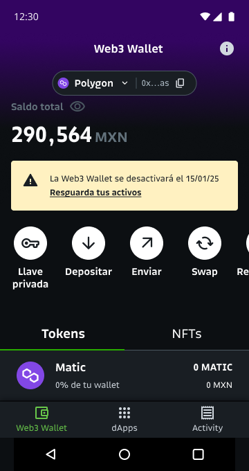
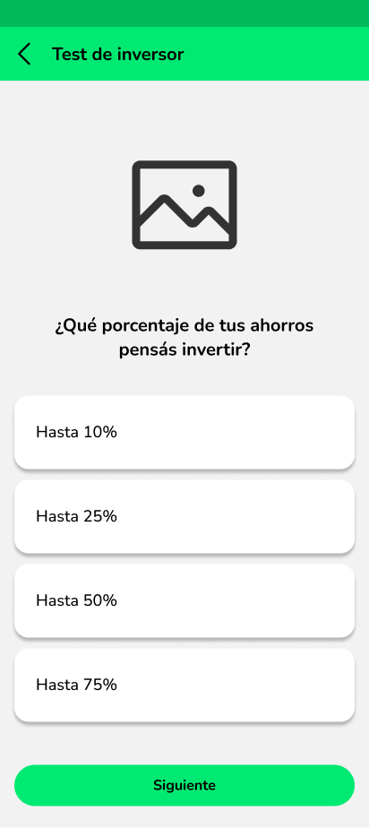
Bitso operated a native Web3 Wallet that allowed users to store tokens and NFTs with full control of their private key. It was a technically complex product aimed at advanced users of the crypto ecosystem. The strategic decision to discontinue the product led to one of the most complex design challenges I've faced: communicating the closure of an active product and getting nearly all its users to complete a critical technical action within a defined deadline.

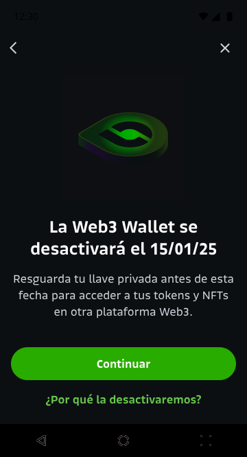
The deadline was January 15, 2025. Every user with assets in the Web3 Wallet had to export their private key before that date, or they would permanently lose access. No recovery was possible after the shutdown.

The business objective was to reach a 90% successful export rate — one of the most demanding benchmarks a product flow can have. For context: 90% success in a complex technical action, with users who in many cases had never interacted with private keys, seed phrases, or keystore files.

The risk of designing this flow poorly wasn't a low metric — it was the permanent loss of real assets belonging to real users.

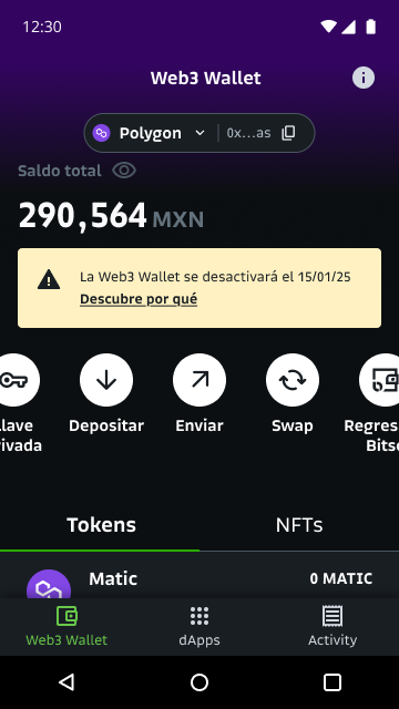
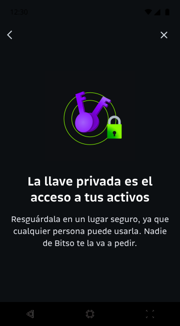
I designed the complete communication and export system. From the first touchpoint — the banner on the Web3 Wallet home with a visible deadline — through to the error state when the export failed.

The hardest decisions were about the export itself: which file format to offer, how to name the downloaded file so users could find it and not lose it, how to structure confirmation that the process succeeded, and how to handle errors without triggering panic.

The biggest risk in this flow wasn't technical — it was cognitive. A panicking user makes mistakes. And in a flow where one mistake can mean permanent loss of assets, the design had to do two seemingly contradictory things: convey urgency (there is a deadline) without generating paralyzing anxiety (which leads to procrastination or errors).

The solution was progressive disclosure: each screen gave the user exactly the information they needed at that moment in the flow — no more, no less.

I designed two banner variants to capture two types of users: those who respond to urgency, and those who need context before acting. The checkbox on the export screen was deliberate friction: in a flow where speed is a risk — someone who exports without understanding may lose the file or not store it safely — adding an explicit confirmation step reduces that risk.

Step Surface Goal
1 Home banner Inform the deadline and generate moderate urgency
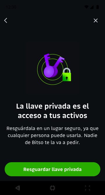
2 Security alert Explain what a private key is and why it matters
3 PIN verification Confirm identity before exposing sensitive data
4 Export screen Execute the file download in a controlled manner
5 Confirmation checkbox Useful friction: ensure the file was saved correctly
6 Final infoscreen Guide the next step outside the app

92% successful export rate, surpassing the 90% business objective. In absolute terms: of every 100 users with assets, 92 completed the process correctly before the shutdown.

What I take from this project is that designing for high-friction moments requires different thinking than designing for growth flows. The goal is not to eliminate all friction — it's to place the right friction in the right place. The checkbox was useful friction. The PIN verification was necessary security friction. Progressive disclosure was the decision that prevented unnecessary friction.

92%
successful export rate
90%
business target, exceeded
0
margin for error on real assets
CryptoWeb3 SecurityAndroid SunsettingProgressive Disclosure

Full case study coming soon
04 · Agripay
Agro-tech fintech
Lead Product Designer · Team of 3

Investments for farming

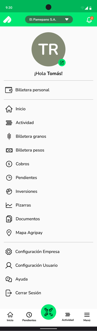
Agripay is a fintech platform designed specifically for Argentina's agricultural sector: producers, brokers, and agribusiness companies. It's not an investment app — it's an agricultural management platform: peso and grain wallets, payments, documents, commodity price boards, logistics.

Investments were a new module. The opportunity was to integrate Galicia bank's mutual funds (FIMA) directly into the platform, allowing producers to invest their surplus without leaving the app they already used to manage their business.

The challenge was dual, and both parts were equally critical.

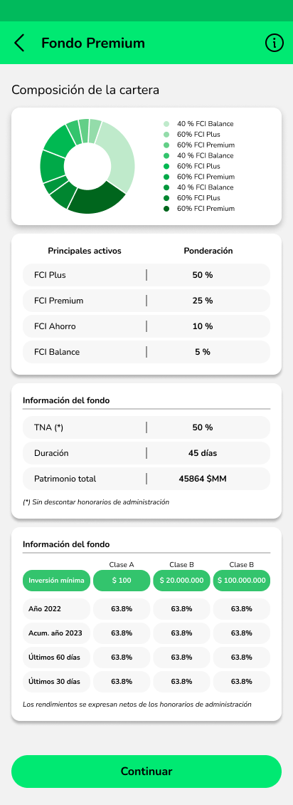
On one hand, regulation: integrating Galicia's financial products required strict adherence to regulatory disclosure requirements — terms and conditions, exact portfolio composition, historical returns, legal disclaimers. Each screen had to be validated by Galicia's legal team. There was no room to simplify what the regulations required to be shown.

On the other hand, the user: an agricultural producer who uses the app to manage harvests, not to invest. Someone who understands soybeans, corn, and USD, but for whom mutual funds, annual rates, and total assets under management are abstract concepts that generate distance rather than trust.

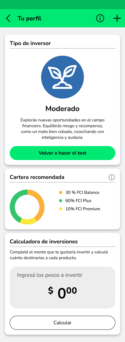
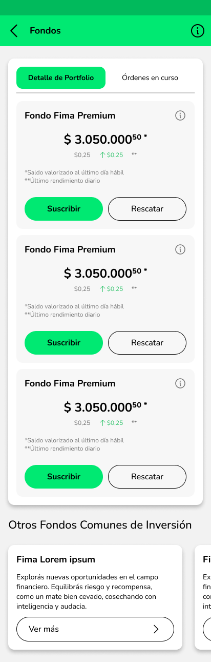
I was Lead Product Designer for the complete module. I led a team of three: one UX designer and one UI designer. I coordinated directly with Galicia's legal team to validate regulatory compliance for each screen. I defined the flow architecture: investor profiling, portfolio visualization, fund detail, subscription and redemption, and investment calculator.

The central question that guided all design work was: how do you explain investments to someone who thinks in terms of harvests?

The answer wasn't to simplify the product — it was to translate it. Not to remove the regulatory information Galicia required, but to contextualize it in the user's world.

I analyzed how other financial products had resolved the tension between regulation and accessibility. The pattern I found: products that work clearly separate mandatory regulatory language — which must be there, but can live at a depth the user accesses when they want — from product language, which must speak the user's idiom.

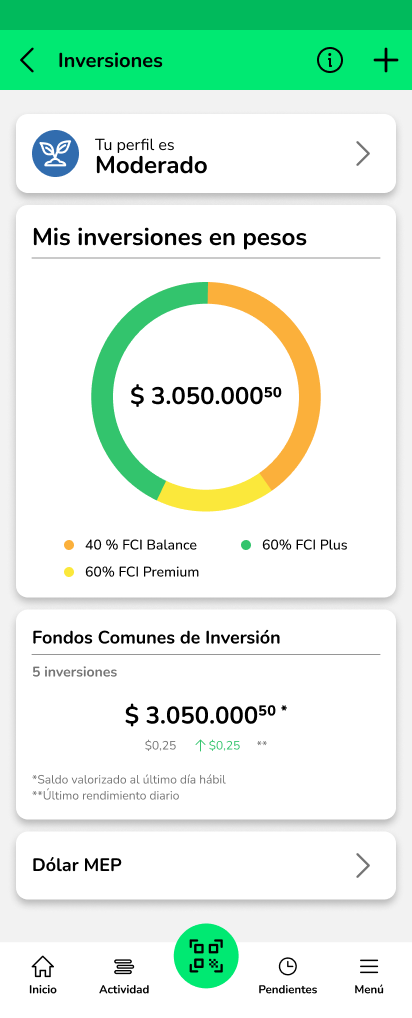
The most important decision was the tone of the profiling system. The 'Moderate' profile could have said: 'Investor with medium risk tolerance seeking balanced returns.' Instead it says: 'You explore new opportunities in the financial field. You balance risk and reward — like a well-brewed mate — harvesting with intelligence and boldness.'

That's not an accident. It's user research applied to copywriting. An agricultural producer immediately understands what a well-brewed mate means: the level of preparation, the balance, the time it requires. It's the same metaphor needed to understand their investor profile.

The investment calculator converts percentages into the user's own pesos — the unit of measure they understand and in which they think about their business.

Regulation required What we designed for the user
Annual rates, total assets in $MM Donut chart with portfolio composition in colors and proportions
Historical returns by asset class Calculator in user's own pesos based on recommended profile
Full T&C before subscribing Progressive depth: summary visible, detail accessible on request
Formal investor profile with risk tolerance Copy in agricultural language: "well-brewed mate", "harvesting with intelligence"

First embedded investment product in a Latin American agro-tech platform. The module passed full regulatory validation from Galicia Banco and was successfully integrated into Agripay's existing ecosystem.

What I value most from this project is the learning about design in complex regulatory contexts: regulation is not the enemy of good design. It's a constraint that forces you to be more creative about how and when you present information — not whether you present it.

×3
team led: Lead PD + UX + UI
2
verticals merged: agro + fintech
1st
embedded investments in LATAM agro-tech
Agro-techFintech LeadershipRegulation Embedded financeiOS FIMA

Full case study coming soon
05 · Bitso
Crypto exchange · 8M users
Product Designer · Design System & Rebrand

Revamp & Rebrand: new identity for 8M users

Bitso launched a full rebrand that redefined its entire visual identity: new palette, new typography, new iconography, and a unified design system. The challenge wasn't just defining the new visual language — it was applying it across a live product with 8 million active users across three countries, without regressions or breaking the mental models users had built over years.

Bitso's rapid growth left accumulated visual debt in the product. Different squads had applied components and styles independently, creating inconsistencies across surfaces and platforms. The rebrand was the opportunity to resolve that debt systemically.

But resolving visual debt in an active product carries a real risk: change enough for the system to be coherent, without changing so much that you disorient the user who already knows the product. The question that guided the work: how do you renew the identity without the user feeling like you swapped their app?

I was the Product Designer responsible for migrating the primary surfaces of the home and trading flows to the new design system. I worked in direct coordination with the brand design team and other product squads to ensure cross-platform consistency throughout the rollout process.

Before designing new screens, we performed a full component audit: which components were out of spec, which had undocumented variants, and which could be migrated directly to the new system without redesign. That audit was the prerequisite for the rebrand — without knowing exactly what you had, you couldn't know what to change or how long it would take.

We defined two principles guiding every decision. The first: hierarchy before aesthetics. The rebrand changed the visual language but couldn't change user mental models. What was primary had to remain visually primary. A Bitso user returning to the app after the update shouldn't need to relearn how to navigate.

The most important decision was the migration strategy: components first, screens after. Rebuild each component in the new system and then compose screens from there, rather than redesigning entire screens from scratch. This reduced regression risk and ensured any change derived from the system — not from individual design decisions.

Migrating to design tokens was the most critical instrument in the process. Moving from absolute values (hex colors) to semantic tokens (primary-action, surface-default, text-muted) was the decision that let the rebrand scale across all squads without constant coordination. With tokens, each squad could update their screens independently and the result remained consistent.

Approach Speed Regression risk
Redesign full screens from scratch Fast per screen High — each decision is independent
Gradual migration without token system Medium Medium — cross-squad inconsistency
Components first + semantic design tokens Slower initially Low — the system guarantees consistency

The rollout was phased: highest-traffic surfaces first (home, trading, wallet), secondary surfaces after. That prioritization allowed us to catch visual issues in production early — before the rebrand was fully deployed across all flows.

Running in parallel to the rebrand, the same launch cycle included one of the most structurally complex initiatives I owned at Bitso: leading the design of traditional finance — TradFi — inside the product. This meant creating the end-to-end experience for ETFs and stocks, making them accessible to the same 8M user base that historically knew Bitso exclusively as a crypto exchange.

The process began with exhaustive research and benchmarking across global TradFi products — Robinhood, NuInvest, XP, Interactive Brokers — studying how each resolved the tension between accessibility and regulatory disclosure for non-expert users. The goal was not to replicate any of them, but to understand what systemic decisions allowed those products to feel simple while carrying the full weight of financial regulation.

From that research, I led the creation of new Design System components specifically built for financial instruments: price chart patterns, portfolio composition visualizations, new decision flows for asset selection and order placement, and compliance-aware layouts that could carry mandatory regulatory disclosures without breaking the visual hierarchy established by the rebrand.

The regulatory dimension added a layer of complexity rarely concentrated in a single project: each country where Bitso operates has different compliance requirements, different rules for how assets can be presented, and different KYC gates before a user can access TradFi products. Designing a system flexible enough to adapt to those country-by-country differences — without fragmenting into siloed implementations — was one of the defining design challenges of this work.

Full deliverables, component specs, before/after comparisons, and TradFi screens are covered by NDA. The project is available for in-depth discussion in an interview setting.

Full migration of home and trading surfaces to the new design system, delivered alongside the TradFi launch. The unified component base reduced handoff time between design and engineering, measured in the number of visual QA sessions required. The token system allowed squads to work more autonomously with fewer cross-squad inconsistencies. The new TradFi components became the foundation for ETF and stock experiences across all Bitso markets.

The most important learning from this project: a rebrand is not a visual design project. It's a systems project. If you don't solve the component architecture and tokens before touching screens, you end up with beautiful screens that are inconsistent with each other.

8M
users reached with rebrand + TradFi launch
Tokens
from absolute values to system semantics
ETFs+
new DS components for TradFi instruments
CryptoTradFi ETFsDesign System RebrandiOS AndroidCompliance Design Tokens

Full case study coming soon
06 · Bitso & Banco del Sol
Payment integrations · PIX & MODO
Product Designer · Payment Systems

PIX at Bitso & MODO at Banco del Sol

Two separate projects at two different companies, but structurally identical in what they demanded: integrating complex third-party payment systems — each with its own protocol, regulatory framework, and user mental model — into products not originally designed around them.

PIX is Brazil's instant payment system, operated by the Banco Central do Brasil and adopted by over 140 million Brazilians. Integrating it into Bitso meant building the first bridge between Bitso's crypto-native environment and Brazil's formal financial infrastructure — a country where PIX has become the dominant payment rail in everyday transactions.

MODO is Argentina's interoperable digital payments platform, used by over 20 Argentine banks. Integrating it into Banco del Sol meant allowing users to pay at physical and online merchants directly from the app, using the same QR-based infrastructure that the rest of the Argentine banking system already operated on.

In both cases, the core problem was the same: how do you bring a payment protocol that users already know from another context into a product where their mental model is completely different?

A Bitso user doesn't think of the app as a place to pay — they think of it as a place to trade and hold crypto. Introducing PIX meant extending the product into a territory the user had never associated with Bitso. The risk of confusion was real: would the user understand they could now receive and send Brazilian reais via PIX from a crypto exchange?

At Banco del Sol, the challenge was different: BDS users already expected to pay from the app. The problem was onboarding them into the MODO protocol — a system with its own QR format, its own authorization flow, and its own error states — without making it feel foreign inside an app that had established its own interaction patterns.

In both projects I was the Product Designer responsible for the complete payment experience: from entry point discovery through to confirmation states, error handling, and receipt design.

Both integrations required close coordination with compliance teams on both sides — the payment protocols carried strict regulatory requirements: what information was mandatory before payment authorization, how to frame confirmation screens, what was required in digital receipts, and what transaction limits applied per user, per day, and per country.

The design approach in both cases followed the same principle: don't ask the user to adapt to the payment protocol. Adapt the protocol's entry point, language, and confirmation pattern to the product's existing logic.

For PIX at Bitso: the entry point was anchored to the familiar concept of the wallet — users already knew how to receive and send assets. The design extended that mental model to include BRL via PIX, without introducing a new paradigm. PIX keys, QR codes, and instant confirmation were presented using Bitso's existing pattern language.

For MODO at BDS: the entry point was positioned in the payment flows the user already knew — the same place they'd expect to pay or transfer. MODO's QR protocol was wrapped in the same interaction patterns BDS had established for other payment actions, making the new capability feel like a natural extension rather than a feature to learn from scratch.

Both integrations carried complex compliance requirements that directly shaped design decisions. For PIX: the Banco Central do Brasil mandates specific disclosure requirements for instant payment transactions — transaction limits by user type and time window, mandatory confirmation patterns, and exact receipt formats. For MODO: the Argentine regulatory framework for interoperable payments required specific authorization flows, limit displays by user tier, and clear merchant category information in the transaction view.

In both cases, compliance requirements were not a post-design filter — they were architecture inputs that shaped the flow structure from the very first decision.

Both integrations are fully covered by NDA. Screens, flows, and metrics are not available for public documentation. Both projects are available for in-depth discussion in an interview setting.

Both integrations shipped successfully within their respective timelines. PIX at Bitso extended the product into Brazil's dominant payment infrastructure, allowing crypto-native users to interact with instant payments without leaving the app. MODO at Banco del Sol completed the bank's interoperability with Argentina's digital payment ecosystem.

What I take from both projects: payment integrations are UX problems disguised as technical problems. The engineering complexity is real — but the design challenge is always the same: how do you make a new protocol invisible to the user?

2
payment systems integrated at 2 companies
×2
regulatory frameworks navigated
0
user education required — invisible onboarding
FintechPayment Systems PIXMODO RegulationCompliance BrazilArgentina

Full case study available under NDA

Design Challenges

Personal work · Projects designed from scratch with full process, prototype, and case study.

Cuadra · 2026

Cuadra

App that finds the moment and place for a group of friends to meet — without anyone having to organize. Full iOS flow, interactive prototype, design system.

See case study →
Nura · 2026

Nura

Multi-currency wallet with Payroll, USDc, and Growth accounts for global professionals. Designed and deployed in 24 hours.

See case study →